Aurin-Miraculum Choir Family Visual Identity System
Client:
Aurin and Miraculum Foundation
Project:
Brand design concept
Duration:
January 2025 –
Services:
Brand identity, Fashion, Graphic design, Logo design, Website
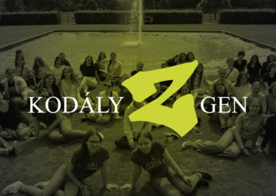
choirs
Designs printed
choir members
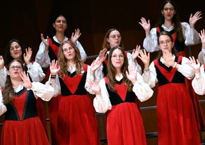
The Aurin–Miraculum Choir Family is one of Hungary’s most prominent choral communities, uniting five ensembles across generations and artistic focuses. Our collaboration began with a clear goal – to create a comprehensive brand identity system that reflects their shared artistic values while preserving each choir’s individuality. Over time, it has evolved into a complex, ongoing design project that connects logos, colors, patterns, websites, concert visuals, and even clothing into one recognizable brand world.
When we began, each choir already had a distinct identity. The Miraculum Children’s Choir used its classic Old English type logo – a reference to its origin in Hungary’s long-standing choral tradition – while the Aurin Choir Family had a more refined, contemporary emblem. Both were strong and deeply rooted in their own stories.
The challenge was to build a unified visual system around these existing logos that could connect the choirs without replacing what they already represented. The aim was to bring together tradition and modernity, creating harmony across printed materials, digital communication, concert visuals, and even performance wear – while ensuring that each ensemble’s personality remained intact.


Rather than redesigning the choirs’ existing logos, we developed a visual system that expands upon them. The characteristic forms and lettering of both Aurin and Miraculum became graphic motifs and pattern elements used throughout the visual universe, in website backgrounds, posters, program covers, and templates.
The only new symbol created was the logo of the Aurin–Miraculum Foundation. Built from fragments of both original emblems, it forms a circular shape symbolizing unity and collaboration. This circle connects the choirs’ visual worlds, acting as a central emblem for the foundation and a bridge between all related materials.
This system allows the Aurin–Miraculum identity to remain authentic while gaining coherence – a blend of inherited character and contemporary design.
Color identity & recognition
Each choir within the Aurin–Miraculum Family now has its own color signature, designed to reflect its character and stage presence.
These colors act as visual identifiers across every platform from the smallest social media icon to printed concert programs or the website’s interface. This consistent palette helps audiences immediately recognize each choir while reinforcing the unity of the entire family. It has become a visual rhythm running through all communication — subtle yet unmistakable.
Digital platform & communication design
The website, www.aurin-choir.hu, serves as the core of the visual system. Designed to organize a large amount of content – from concerts and tours to archives and news – it combines functionality with a strong emotional presence.
Our approach was to balance clarity and atmosphere: creating an easily navigable structure enhanced by the brand’s visual language – color codes, logo-based patterns, and unified typography. The result is a comprehensive, living platform that grows alongside the choirs’ activities, ensuring that every concert announcement, image, or update fits into the same cohesive visual world.
We extend this system into concert graphics as well, carefully composing color combinations from the palette to reflect both the choirs involved and the character of each program.
Visual presence & collaboration with pitch-stitch
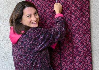
The Aurin–Miraculum identity extends across both digital and physical dimensions from posters and printed programs to concert backdrops and stagewear. In collaboration with pitch-stitch, we design clothing and accessories that translate the choirs’ identity into wearable form.
For the Hong Kong tour, this included custom-made t-shirts, raincoats, and clothing bags, featuring the choirs’ signature motifs and colors. These items unite practicality with visual storytelling, turning the choirs’ brand into something that accompanies them wherever they perform.


The unified brand identity has strengthened communication, improved recognition, and brought new coherence to how the Aurin–Miraculum Choir Family presents itself on national and international stages.
From the very beginning, this was conceived as a brand design concept, not merely a logo exercise. It has since developed into a comprehensive visual ecosystem, where each color, line, and pattern contributes to the same narrative – a family of choirs connected through music, tradition, and shared values.
The project continues to evolve: new applications are added each season – concert visuals, digital campaigns, and clothing designs – ensuring that the Aurin–Miraculum identity remains as dynamic and vibrant as the music it represents.